Three case studies. Each one started as something that annoyed me or someone near me, and each was designed and built by me alone. The interesting part of any of them is not what shipped, it is what I chose not to do.
Kitchen to Dinner
Amari
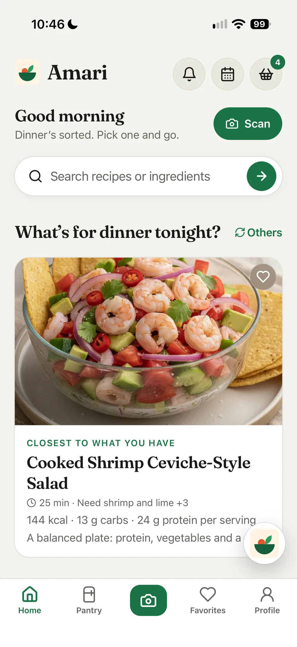
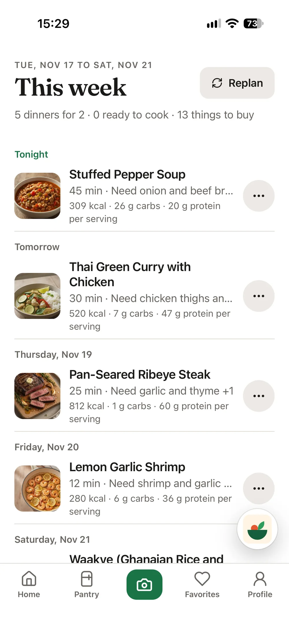
Photograph what you have, get meals you can actually make tonight
I own ingredients and still order food. The gap is not cooking skill. It is the thirty seconds of standing in front of an open fridge trying to hold six items in my head and match them against recipes I half remember.
Every recipe app solves the opposite problem. They assume you already know what you want to make and need to go buy the things. I wanted the inverse: start from what is physically in front of me.
Photograph to meal list, the core loop.
The decision I care about most
A photo never maps cleanly onto a recipe. You are almost always short something. The obvious build returns only perfect matches, which means on most nights the app returns nothing and you close it.
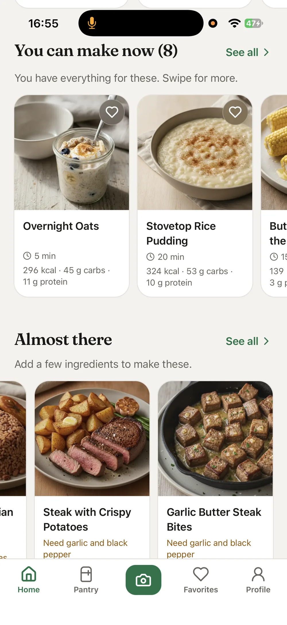
So results are split in two. Meals you can make right now sit at the top. Underneath is Almost There: meals you are one or two items short of, each showing exactly what is missing.
That section does something I did not plan for. It turns the app into a shopping aid without ever becoming a shopping app, because the missing item is attached to a meal you already said you wanted.
An empty result is a dead end. A result that says you are one egg away is a decision.
The model proposes, the user decides
A vision model will misread a jar sooner or later, and a meal built on a wrong ingredient is worse than no meal at all. So nothing the camera detects is treated as fact.
Every scan lands on a confirmation step. You see each detected item and its quantity before a single recipe is generated, and you can add something the camera missed, correct a quantity, or remove an item entirely.
That last option turned out to matter for a reason I did not expect. Most removals are not corrections. The camera was right, the user simply does not want to cook with that thing tonight. Treating the scan as a proposal rather than an inventory covers both the model being wrong and the person changing their mind, which is the more common case.
Constraints that shaped it
—Dietary rules and allergies are set once in the profile and filter everything after, rather than being re-entered per search. A person’s constraints do not change between Tuesday and Wednesday.
—The decision happens standing up, holding a phone, mildly annoyed. Nothing in the main loop should need more than a glance.
—Results are limited to recipes verified through authorized food platforms and what already sits in my own database. The app will not invent a dish to fill a gap, which means it sometimes returns less than a user hoped for. I would rather under-deliver than hand someone a recipe nobody has cooked.
What I would change
Search still matches on keywords and phrases, which means it only works when you already know what to ask for. It should read intent. Someone typing "date night food ideas" is not naming an ingredient or a dish, they are describing an occasion, and the app should answer that with something relevant rather than hunting for a literal match.
That is the gap between a tool you query and one you talk to, and right now Amari is still the first thing.
Campus Grocery Ordering
B-Mart
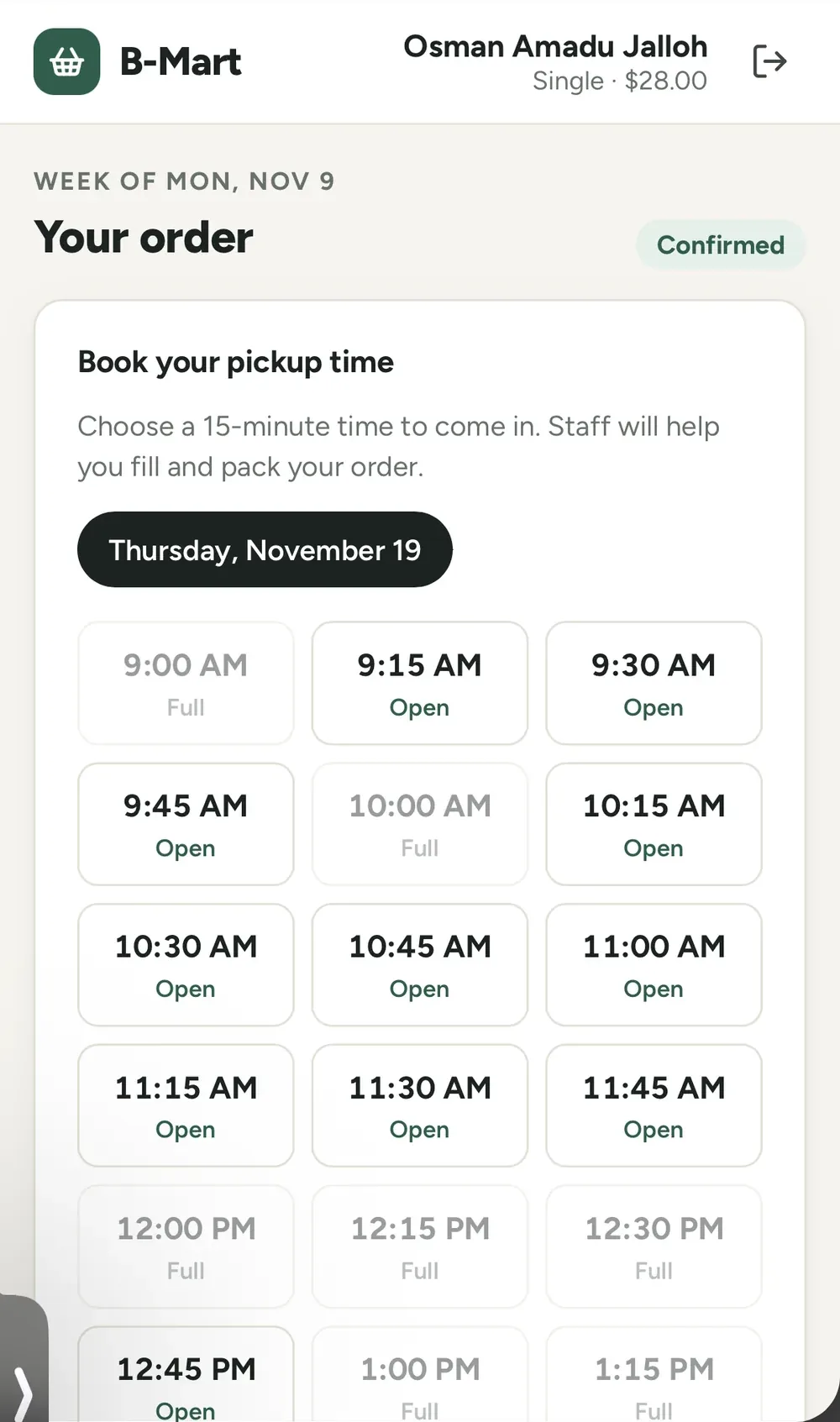
An ordering system built around fairness rather than checkout
Role
Sole Designer and Engineer
Period
2026
Status
Live, in weekly use
Live
Internal tool
CloudflareSupabaseAdmin dashboard
The problem
B-Mart is a small grocery for non-traditional students at Berea, restocked every two weeks. I help run it as part of my role in the Non-Traditional Student Program.
Access was by key card, and whoever arrived first took what they needed. Households that came late found empty shelves. The shortage was never in the budget. It was in the distribution.
The first fix was a sign-up form and pre-packed bags. It worked, and it consumed staff hours every single cycle, which meant it was never going to survive.
Why this is a design problem and not a store
Every e-commerce pattern assumes the shopper spends their own money and the only limit is their wallet. Here the money is a program budget, inventory is fixed for two weeks, and the actual goal is that a family of four and a single student both leave with something appropriate.
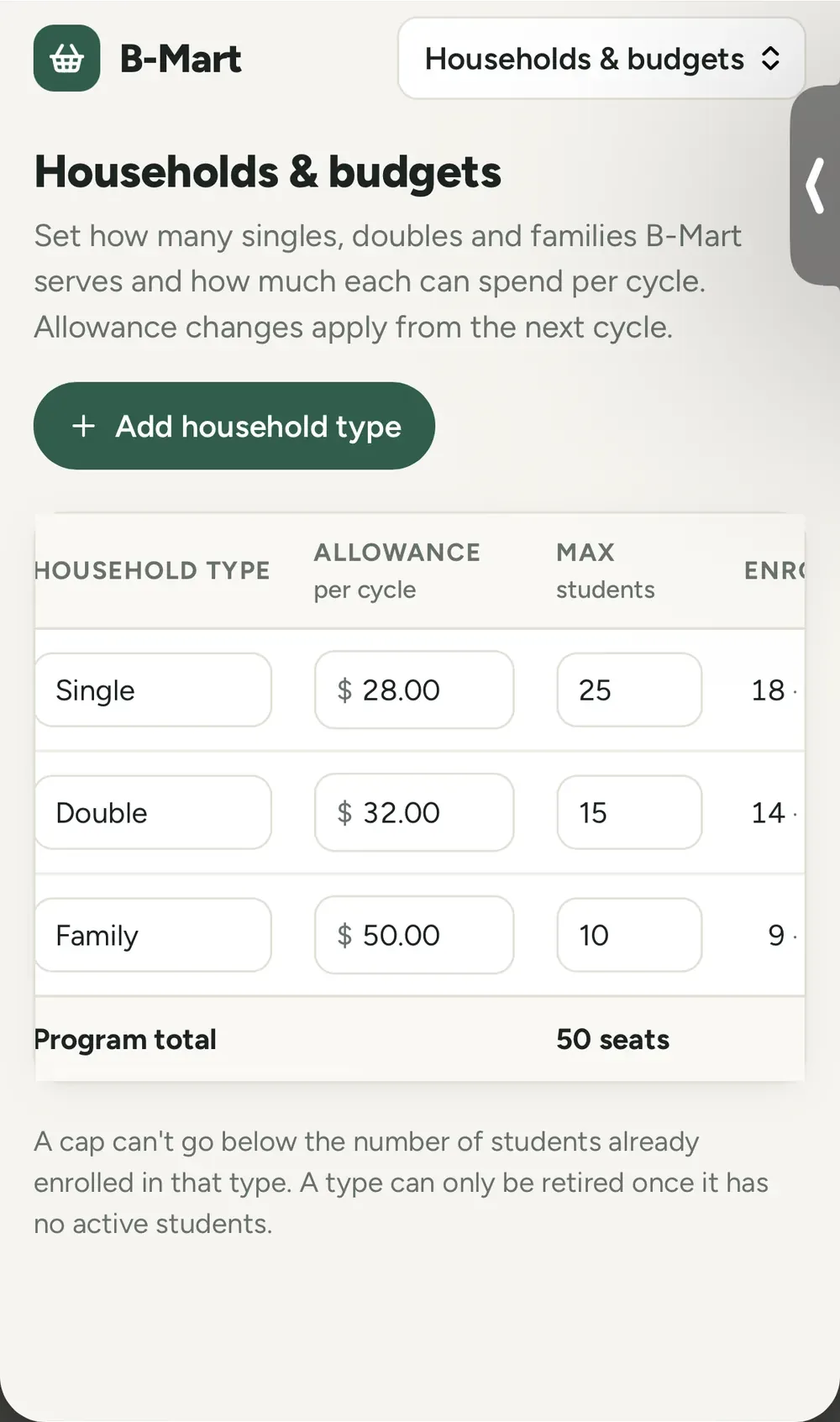
So the system runs on an allowance rather than a cart total. Households are categorized as single, double or family, each with its own spend limit. The interface has to make that limit feel like a fair share rather than a restriction, which is a tone problem as much as a layout one.
The hard part was not the ordering flow. It was designing a limit that does not feel like a punishment.
The admin side
Staff set how many single, double and family allocations exist in a cycle and how much each can spend. That had to be adjustable mid-cycle by someone non-technical, without calling me.
Orders are placed by staff at Walmart using the program card. The software never touches payment. It coordinates, and deliberately stops there.
Where it stands
B-Mart runs weekly as an internal tool and took over 480 orders in its first three weeks. The sign-up form and the pre-packed bags are gone.
The number I care about is not the order count though. It is that staff no longer spend hours each cycle assembling bags by hand, and households that arrive late are not the ones who go without.
What I would change
Ordering is built on a curated catalog I maintain, which means product data goes stale and anything new has to be added by hand.
The fix is direct integration: order links and APIs from Walmart or another grocery source, so products and availability come through live instead of being mirrored. That also closes the last manual step, since staff currently re-enter the order on the retailer’s side.
Verified Campus Discovery
Fynd
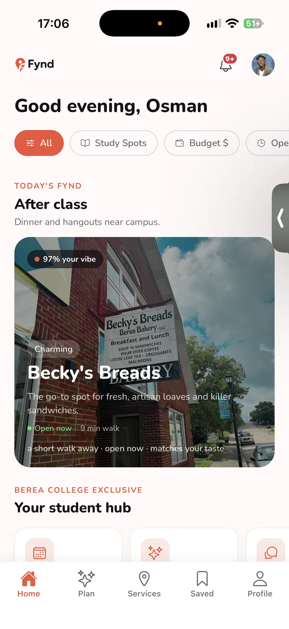
Discovery where everything you see belongs to your own campus
General review apps know a restaurant’s rating across an entire city. They do not know which places students at your school actually go to, which ones take your meal plan, or which are reachable without a car. For a campus like Berea, that context is most of the useful information.
The decision with a real cost
Content is scoped to a verified campus. That is what makes a recommendation trustworthy, and it is also a wall at the front door: every user has to prove they belong before they see anything.
I took that cost knowingly. A discovery app anyone can post to becomes the thing it was meant to replace, and the value here is that a recommendation comes from someone in your situation.
So the wall is partial rather than absolute. Before verifying, anyone can browse places and read their details. What stays behind verification is everything campus-specific: who at your school goes where, what students say about it, anything tied to your own community.
That split does the work. A visitor can see the app is real and useful before being asked for anything, and the part worth protecting is still protected. Locking the whole thing would have made the signup a leap of faith.
Shipping it
One React Native codebase serves iOS and web, which kept the two from drifting apart on a one-person project.
Going through App Store review, including privacy labeling and accessibility compliance, forced decisions about contrast, touch targets and labeling that I would otherwise have deferred indefinitely.
What I would change
The app knows a place is near campus. It does not know enough about a student’s actual day to say whether that matters right now.
Relevance should come from the things that genuinely shape where a student eats: whether somewhere takes a meal plan, whether it is open after a late class, whether you can get there without a car. Those details exist in the data. I have not yet used them to decide what surfaces first, so discovery is still closer to a directory than a recommendation.
How I work
I design and build in the same pass, which means the work is usually less polished than a pure design portfolio and more finished than a pure engineering one. Everything on this page runs.
Currently looking for a Summer 2027 product design internship.